The unit, "Postcards from Home", focuses on photography created in photographers homes. I feel like this unit is very fitting since COVID restrictions made it so lots of photographers have been forced to create their works from their own living space, given this situation many photographers and artists in general have been exploring the boundaries of what can be created whilst isolated in their own houses. Although COVID restrictions are hardly what they were last year, I think that it is still very interesting to observe what can be created given limited resources and space to work. Genres of photography that are very limited thanks to the restrictions that this unit creates are situational and documentary, whilst still life and portraiture photography takes hold.
Aïcha Fall
Aïcha Fall is a photographer from Côte d’Ivoire, who lives in Paris. She explores her identity, culture and traditions through her photography. Her photographs display very bold colours and imagery. Aïcha fall has said "I wanted to narrate black bodies capable of doing wonders, or just black bodies existing simply and beautifully." about her project "A Seat at the Table". She also said about her process of creating these photos "I create my images with essentially what I found around me, for example all the images are shot with an iPhone, the studio was improvised from my father’s garage, with tools we use in our daily life." I think that it's incredible that photos of the quality were achieved with such little resources and it really shows her ability as a photographer. I think that I can take a lot of inspiration from Aïcha Fall, because usually when I try and take photos, I want them to be quite elaborate and sometimes waiting for my camera's battery to be fully charged slow me down and sometimes i miss good opportunities for photos because I want all the photos I take to be captured with my camera.
Aïcha Fall is a photographer from Côte d’Ivoire, who lives in Paris. She explores her identity, culture and traditions through her photography. Her photographs display very bold colours and imagery. Aïcha fall has said "I wanted to narrate black bodies capable of doing wonders, or just black bodies existing simply and beautifully." about her project "A Seat at the Table". She also said about her process of creating these photos "I create my images with essentially what I found around me, for example all the images are shot with an iPhone, the studio was improvised from my father’s garage, with tools we use in our daily life." I think that it's incredible that photos of the quality were achieved with such little resources and it really shows her ability as a photographer. I think that I can take a lot of inspiration from Aïcha Fall, because usually when I try and take photos, I want them to be quite elaborate and sometimes waiting for my camera's battery to be fully charged slow me down and sometimes i miss good opportunities for photos because I want all the photos I take to be captured with my camera.
|
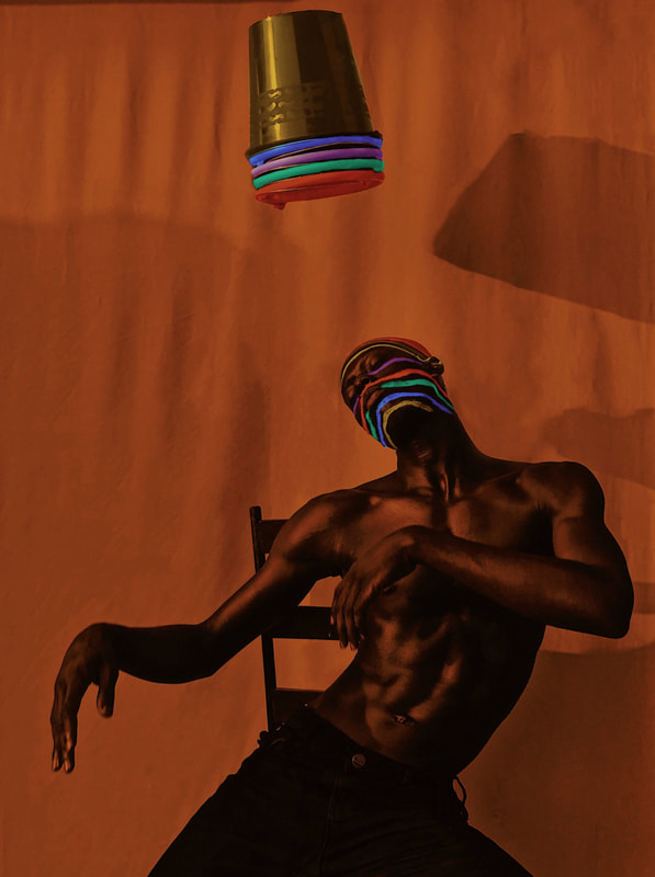
This was the Aïcha Fall photo that I was most impressed with. The first thing that struck me about this photo is obviously the subject, and the strange way they are positioned, I think that this pose with his arms loosely out in front of him and his head turned with his eyes closed, makes it seem like the subject is in a fluid movement. Above his head is what seems to be different colourful buckets stacked on each other which somehow appears to be floating without any support. When I first saw the buckets I assumed that it was some sort of large multicoloured light that was projecting the colours that you can see on the subjects face. But as I looked closer I realised that the colours are actually painted across the subjects face in stripes. In my opinion the way that the stripes bend as they go across the different shapes of the subjects face add to the idea of fluid movements shown in the way that the subject is positioned. One other way I feel that this image reflects this idea is with the fabric that is used as the backdrop to this image. The shadows from the buckets and the subject that are projected onto the bumped material look almost like waves or sand dunes.
I hope that in my own photography I can explore different colours and movements the same way that Aïcha Fall does. |
|
Delfina Carmon
Delfina Carmon is mostly a portraiture and still life photographer from Argentina, that typically makes use of shadows, reflections and refractions. Essentially she makes use of light to create shapes in her compositions. She describes her own work as "Small scenarios and performances where self-portraits, compositions with objects and shadows became a form of expression that synthesizes a part of who I am."
Delfina Carmon is mostly a portraiture and still life photographer from Argentina, that typically makes use of shadows, reflections and refractions. Essentially she makes use of light to create shapes in her compositions. She describes her own work as "Small scenarios and performances where self-portraits, compositions with objects and shadows became a form of expression that synthesizes a part of who I am."
|
I think that specifically her use of light and shadow, can add an enormous amount of depth and can create very intricate and powerful imagery from what could be considered household objects. I specifically like this example to the right from her work with the cosmetics company "Revlon" because of its intriguing use of various techniques that I have already mentioned. One thing that you may notice first is the shadow of the hand that is spread across the composition of the photo. I think that this simple detail of a human touch adds a lot to the work that would be considered still life without it, I think that this photo would look kind of empty and would have way too much negative space if the hand wasn't there also. You may assume that the red coloured part of the photograph is simply red painted wall but if you look closer you can see that it's actually light being projected through some kind of red glass or plastic gel or some similar translucent material. I think that this works very well since the red fits the colour of the makeup and also compliments the shape of the hand in the back. Another thing that I find interesting about this photo is the way that the shadows of the hand and the makeup seems to be warped across the background, I think that the stretched shapes add a lot to the image, in my opinion kind of replicating the way shadows look in the early morning, I feel like this feeling is also added to through the use of the glaring light being reflected in the mirror looking similar to a rising sun. One thing that does contradict this imagery though is the fact that all the light is white and stark apposed to the typical colours of an early morning, yellows and oranges. I feel like this visual juxtaposition creates kind of an uncanny and otherworldly feel about the photo.
|

|
I think that I can also take inspiration from Delfina Carmon, i am definitely intrigued by experimenting with different light and colour in my photography, I also think that i should practice creating still life photography after seeing how interestingly Carmon has implemented the genre and combined it with forms of portraiture. Much like Aïcha Fall I believe that Delfina Carmon is very resourceful in her photography, the way she can create such intricate and complicated photos without anything much interesting to photograph is definitely very inspiring to me and I think I'd definitely like to try to create photography similar to her work.


This photoshoot was my first response to the postcards from home project, we were told to take photos using the props provided to us by Miss, I was particularly influenced by the work of Delfina Carmon when it came several different choices during the time I took these photos, for example I decided to choose mainly glass or reflective props I feel like this worked well with the lighting that I had chosen, the idea that I had for lighting was using a yellow plastic sheet that I found in the classroom and then shining a bright light through it, using either the big diffused lights in the photography room or just the flash on my phone. I love the textures and intricacies of some of these photos and I feel like the shell looks almost like a cave in some of these photos. My one problem with this set of photos though is that it doesn't particularly fit the theme of 'Postcards from Home'. I think because the objects that I used were not my own and that they were borrowed from the art department, these photos don't have much of a personal connection to me or my home. I am definitely proud of how these came out visually but I feel like there is a lot more to be explored within this topic that I haven't touched on here.
Niall McDiarmid


What do you find interesting about these photographs?
I find the colours in these photos interesting, I think that the colours have been carefully selected and they all work well together and also well with the type of film that he uses.
What do you think of the concept, or the idea behind these photographs?
I think that it's interesting to look at the everyday life of people, and having a perspective on aspects of life that people can take for granted or just see as standard.
Why do you think that the series took so long to photograph?
I think it may have taken so long to photograph because it's hard to capture the right moments when you are taking candid portraiture, assuming that this is candid portraiture and not composed.
Do you think that the images are natural or are they composed? Give reasons for your answer.
I think it's a lot more likely that these photos are natural, considering they seem like a standard display of someone eating breakfast, without anything I'd consider to be out of the ordinary, if these images are composed then I'd be very impressed with how natural the photographer has made the photos feel. Composing photos in order to make them look candid is not something I've explored so far and I find it to be a very interesting concept.
Are the similarities within each frame?
Yes, I see motifs in every aspect of these photos, in the colours, the props, the lighting and even the mood, I would imagine that this is intentional, as it highlights the routine nature something like breakfast becomes in everyday life.
Can you see the subtle differences?
In most of the photos, the the food that's being eaten is different, it's interesting to see how the composition of the table changes depending on the meal being eaten.
If you could choose two visual elements within each image that the photographer has chosen to focus on what would they be?
Light and colour seem to be the two elements that stand out the most on these photos, the light of the rising morning sun seen in the set of photos is associated with breakfast, and the bright colours of the food and plates is something that stands out a lot in these photos.
Which is your favourite photograph of this series? Why did you choose that photograph?
My favourite photograph in this series is the birds eye view of the table, with the strawberries and the journal. I think this photo is the best display of McDiarmid's use of light and shadow, with the shadows being projected across the length of the table.
What questions would you like to ask the photographer about this series?
I think I'd ask him about my interest in whether the photos were candid or composed, a good follow up question to this would be if he'd considered that people would question this about his photos and what his intended effect on any spectators of the photos would be.


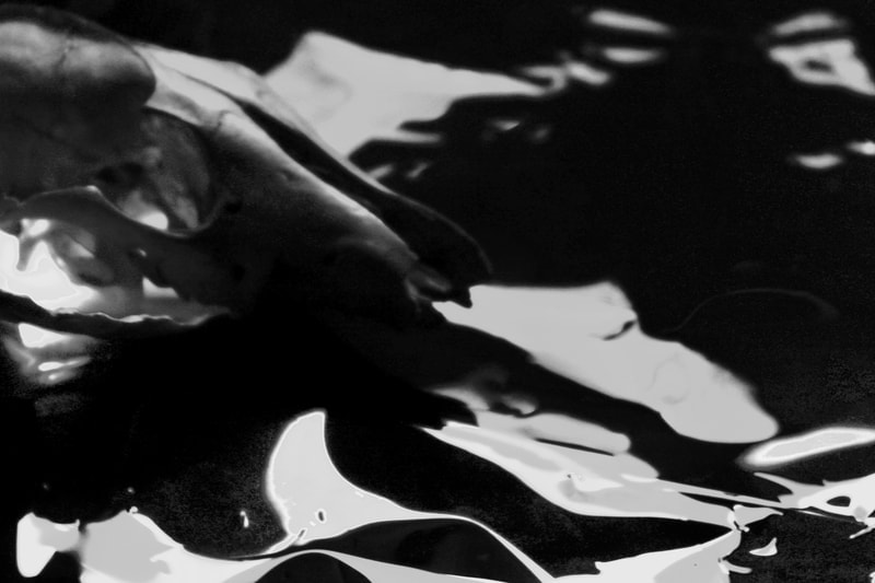
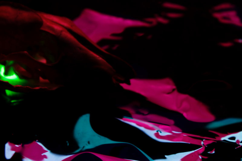
These are the photos I took in class with a group, we were supposed to have brought in our own props from home but we used props from the art department instead. In these photos we explored different ideas and look to how we wanted the photos to look and everyone in the group took the photos individually. One thing that I wanted to explore in these photos that I'd looked at in earlier photos waas exploring the reflection and refraction of light. To achieve the look that I wanted I used some of the translucent material that I found in the class and put my phone, with it's flash on, before placing the props on top of the material and shining different lights at the whole thing. I think that I achieved the effect I wanted to a certain extent but I also didnt like how bright and unnatural some of the lighting looked, especially in comparison to some of the more natural elements of the props such as the skull and the fossil. Because of this I converted all of the photos into black and white and used them as if they were seperate photos, I like how some of these came out as black and white more than the original coloured versions and vice versa for others. I especially like how the translucent material came out, with the reflections and refractions looking almost like liquid.
|
|
I think that these two versions of the same photo show the benefits and drawbacks of using black and white. I do think that the black and white definitely aids the image and i do prefer it to the colour version mainly because it shows the shape of the skull better, something that wouldn't have been able to have been done on the coloured version without the highlights of the different light being too bright and distracting. I also think that it creates kind of more ambiguity to what the material that I used is. With the colour, I think that it makes it obvious that i was using different coloured plastics, but with the black and white version I think that it would be more confusing to to a viewer, and they may think that the skull is on liquid. However I do like certain aspects of the coloured version of this image, for example I like the contrast of the purple and the blue light on the plastic. Unfortunately I see this attempt falling into some of the same problems I had with my first attempt,


These are the photos that I took of a river walk near my home, I chose to take these photos as a part of the postcards from home component, I think that although these are outside and pretty far from my house they still fit in with the topic as I go on this walk a lot when I feel at my worst, and so I consider this pathway to be quite homelike. At the time of me taking these photos I was walking with my Mum, and didn't originally go out to take photos so I had to take them with my phone as I didn't bring my camera. Overall I don't really think that these photos are not the best I could do for this project, although the walk does seem like home to me and I do think some of the photos are pretty, I feel like photography along walks on the Thames, especially during sunset, is kind of played out, for example at one specific part of the walk, there is nearly always a line of photographers with cameras on their tripods, all with their cameras facing the exact same angle of the skyline during sunset hours. Although of course I didn't take the same photo that all the photographers were attempting to take, I do feel as if these photos only come off as photos related to this type of commercialized view of the London skyline and I'm sure there has been many photographers before me that have taken very similar photos to what I have done here. Overall I think what I want out of this topic is something more personal to me, something I think reflects who I am and my home. This project definitely intrigues me and I have had a lot of ideas surrounding it ever since we started doing work on it but I have produced nothing from what I envisioned. It's frustrating to see the lack of motivation I have especially in comparison to the way I feel about my abandoned ideas and concepts. Everything I've done in this project so far I feel like have only been processes of learning, I've realised after all of my photos that have underwhelmed me for Postcards from Home that what I really would like to do is be a lot more expressive with my photography, I want to try my best to avoid cliches and being overly influenced by other people's work from now on. Recently I have started to take a few personality changing medications since I started having my psychiatrist and I have described the feeling of being on these medications as "being in someone else's house", due to the medication I take and also probably me growing up I can feel myself changing into almost a new person. I hope in my next work I can find some way to express this as I feel like it's a very important part of my life that is being left with no way of me showing this or creating more personal work, not just for my A - level but also as a way for me to express what's on my mind. I think that it's very important for everybody to be able to express themselves truly and fully no matter how they feel, and I've tried my best to keep doing that in everyday life, avoiding repressing how I feel at all cost. I think that it would be great for me to show this in my work.
For my diptychs I have decided to go for a theme, in the work I want to try and show some of the nightmares that I have, with a more edited photo that explicitly shows the imagery of what i see in my nightmares and a more implicit and simple photo used as a representation of how I feel, I don't have so many interesting nightmares that I think would be enough to create a full set though so I might try and take some photos based off of fears or other emotions in a similar style of diptych to so I can add more to my set. I think that I can use some of the earlier photos in my sets as backgrounds to some of the photos that I wanna take.

Thought I would do a disclaimer that I didn't use real loose teeth for this photo, it's probably obvious from my lack of sculpting skills but I made them out of plasticine. Anyway I made this diptych following the theme of nightmares I wanted to do, I based this one off of the recurring nightmare I have that all my teeth fall out. I feel like the contrast between the two photos is very visually interesting, I like how heavily edited and more complicated the top photo is in comparison to the more unedited and simple photo on the bottom. The colourfulness of the top photo compared to the monochromatic bottom image particularly stands out to me.
|

I like this diptych but it doesn't fit the theme of nightmares that I wanted to go for, I really just made this one as like a filler out of some of the photos that I took earlier in postcards from home but this doesn't really represent anything. I do think these photos contrast well with each other and I think that together they look a bit like the tooth diptych with the more colourful image at the top and a black and white seeming one at the bottom. Despite the fact that these photos weren't taken with the concept of nightmares in mind I feel like the imagery in them is almost fitting especially the skull in the bottom image, I feel like the image in the top also more or less fits the theme too because it looks almost like a claustrophobic cave, something that I do also have a fear of. I've found this to be a good example of how you can draw meanings out of your art, despite not having the intention of it conveying that message in the first place.
|

This diptych also seems unnerving to me, although I can't exactly put my finger on why, I feel like it may be because the plastic on the top photo looks like the open sea, whilst the bottom photo uses other aquatic imagery, such as the shells. I've had nightmares about the open sea, and so this is the reason I feel it also fits into my theme.
Final Evaluation:
I'm not sure that I completely achieved what I wanted to with these images, but I think 'Postcards From Home' has worked well as an investigation of my creative style as well as myself. If I had more time to work on photoshoots within this theme I think I'd make sure that everything I was doing was a lot more personal to me, using imagery that I feel more connected to and have more experience with. I'm happy with the results aesthetically and I've learnt a lot about still life photography through ways that I don't think I would have explored otherwise so, I'd consider my work in this topic to be a success. Something I know now that I need to work on is the quantity of my work, I consider myself to be quite a perfectionist so I don't always like to just put any photo I want onto my website, but I've realised that a lot of my struggles in this topic have been because of a lack of photos to work with.
I'm not sure that I completely achieved what I wanted to with these images, but I think 'Postcards From Home' has worked well as an investigation of my creative style as well as myself. If I had more time to work on photoshoots within this theme I think I'd make sure that everything I was doing was a lot more personal to me, using imagery that I feel more connected to and have more experience with. I'm happy with the results aesthetically and I've learnt a lot about still life photography through ways that I don't think I would have explored otherwise so, I'd consider my work in this topic to be a success. Something I know now that I need to work on is the quantity of my work, I consider myself to be quite a perfectionist so I don't always like to just put any photo I want onto my website, but I've realised that a lot of my struggles in this topic have been because of a lack of photos to work with.
