


These are some of the first photos I took with my Phone, I didn't initially take them thinking about Text, but I think that these images would lend themself well to this topic. I particularly like the lighting in these photos, it was pretty sunny on the days I took them which gave some nice directional lighting and shadows. I really wish I had my camera with me when I was taking these because the quality of photos that my phone takes are pretty low but I am still pretty happy with them.


These are the photos I took the day after I took the photos of the factory on my phone. Unfortunately the weather was pretty terrible and the sky was covered in clouds which made the light very soft which stopped there from being any directional light and shadows which was what i was going for, despite this i still like a lot of the photos although in a completely different way. The photos look very gloomy and the lack of interesting lighting does make them slightly boring in my opinion. I do intend to come back here to the same location in order to replicate a similar feel that the photos that I took with my phone had.
Jim Goldberg
This is my analysis of one of Jim Goldberg's photos, I've already said everything I wanted to say in the image above but I do want to say that I really like Jim Goldberg's work and enjoyed his exhibition of Raised By Wolves that I had seen in the Barbican.
|
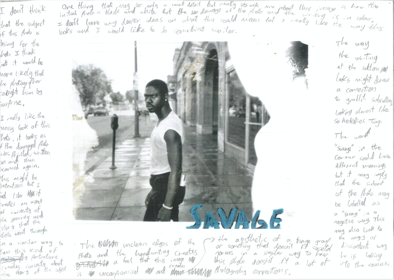
How does the photographer incorporate text into his book?
The Photographer reserves double spreads of pages for the large text seen in the book, acting as an element of storytelling that connects the various photos. What is unusual about the way in which text is incorporated? Despite the fact that the texts play an important part of this photo book, there is no pattern in where it is shown and the text is so enlarged in the double spreads that it may be difficult for a spectator to read. This makes the book less accessible to some. How does he use image and text to blur reality and fiction as an approach to documentary? Max Pinckers uses a mix of found and taken images throughout the book with no real indication of which is which, this makes the readers speculate on which is real or not, in both the images and the stories. Describe his use of metaphor, symbolism, paradox, play, oxymoron and text: I really like the way the photographer creates an aspect of uncertainty within this photobook, and I would like to incorporate this own approach to photography within my own work as a way to create my own worlds that are completely up to the interpretation of the viewer. |


These are a jumble of photos I took over a long period of time whilst I was in the Isle of Wight with my family. My favourites of these are the ones with the smoke going through the woods, I was on a steam train when I took these photos and I think I got lucky with a lot of the photos since of course the train was moving fairly quickly and I could've easily missed some of the photo opportunities.
|
|
|
|
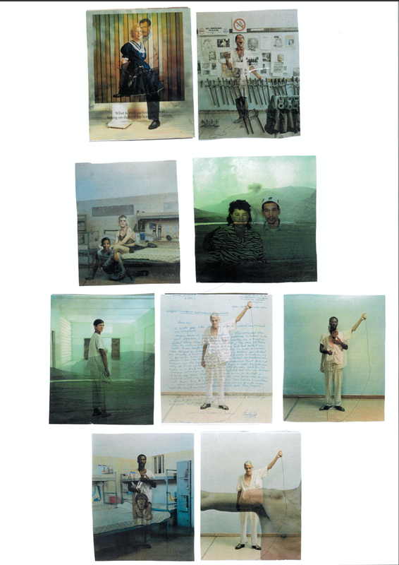


We were given these photos and told to analyse them and then create an arrangement using them. I was very interested by all the pictures and took time trying to speculate on what they could mean or represent. At the end of the lesson Miss revealed to us that the photos that I had been arranging and speculating on were in fact products of printing errors where two unrelated images had been printed on top of each other. I found it interesting that I had created some sort of narrative and meaning of these photos although the creation of them were entirely accidental. It definitely took me by surprise when I learnt this as some of the images make an uncanny amount of sense when overlayed on top of each other. I think that this photobook definitely relates to the principles of the Kuleshov effect that I talked about on a previous page. The brain is quick to make relations to two different photos placed near or on top of each other due to the brain trying to work out it's meaning. I think that I would definitely like to explore something similar within my own work, I think that the way in which photos relate to each other gives a photographer a lot more opportunity than what can be achieved in the composition of a single photo. I feel that it gives the artist a lot of freedom in experimenting with ideas of story and perspective.
|
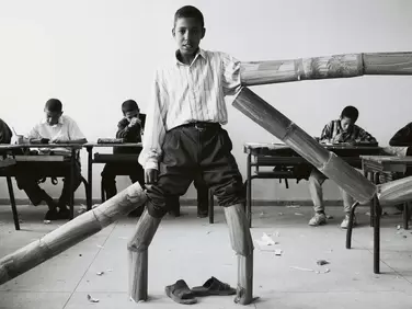
Hicham Benohoud
Hicham Benohoud is a Morrocan photographer and teacher. His collection of photos titled "The Classroom" or "La Salle de Classe" were taken from 1994 to 2000, with it's subjects being Benohoud's students during his time as a teacher. He instructed his students to pose or perform for the photos, using a range of props and accesories. In a lot of the photos in this group, the students in the background are seen to be working quietly in the background despite the variety of strange performative poses that the students in the foreground are taking part in. I have been wanting to get into more portraiture photography and I feel like these photos definitely inspire me to continue to pursue that genre of photography. |
|
Dérives
A dérive ("drift" in french) is a strategy used by various artists as a way to explore the environment around them. The idea is that you let go preconceptions you have of where you want to go and let your surroundings and terrain lead you on a journey in a typically urban environment. As of writing this I haven't started to try to go on my own dérives but I admit I am skeptical of the concept. I do enjoy wandering to places that I don't know and exploring things I come across, however the way in which dérives have been explained to me leaves me with doubt. When I go out to take photos, part of what makes it so entertaining to me is to follow what I figure will be the best photo. By "drifting" you are supposed to leave any preconceptions of what you want and purely be "lead by the city". I have been told that my photos need to almost document my surroundings. I don't feel like this appeals to me either, In my photography being able to have an accurate portrayal of my subject is not usually a concern for me. I enjoy being able to abstract or edit anything that I can take a photo of, and I feel like a need to be truthful to what is around me would restrict this. One part of me dislikes this concept, seeing it as somewhat pretentious, covered by it's unnecessarily wordy explanations and history seemingly describing it as some kind of "intellectual" passtime, but I will try my best to not be so pessimistic towards dérives, there is no doubt in my mind that attempting things that you are unsure about is a sure way to improve your style, even if all you gain from doing it is the knowledge that you never want to do it again.
A dérive ("drift" in french) is a strategy used by various artists as a way to explore the environment around them. The idea is that you let go preconceptions you have of where you want to go and let your surroundings and terrain lead you on a journey in a typically urban environment. As of writing this I haven't started to try to go on my own dérives but I admit I am skeptical of the concept. I do enjoy wandering to places that I don't know and exploring things I come across, however the way in which dérives have been explained to me leaves me with doubt. When I go out to take photos, part of what makes it so entertaining to me is to follow what I figure will be the best photo. By "drifting" you are supposed to leave any preconceptions of what you want and purely be "lead by the city". I have been told that my photos need to almost document my surroundings. I don't feel like this appeals to me either, In my photography being able to have an accurate portrayal of my subject is not usually a concern for me. I enjoy being able to abstract or edit anything that I can take a photo of, and I feel like a need to be truthful to what is around me would restrict this. One part of me dislikes this concept, seeing it as somewhat pretentious, covered by it's unnecessarily wordy explanations and history seemingly describing it as some kind of "intellectual" passtime, but I will try my best to not be so pessimistic towards dérives, there is no doubt in my mind that attempting things that you are unsure about is a sure way to improve your style, even if all you gain from doing it is the knowledge that you never want to do it again.
|
|


These are my combinations of one of the images that i found with a randomly selected page from a photobook.
I think that finding these discarded home photos has really inspired me to in my ideas for photography, I like the idea of found photography and very much enjoy the process of speculating on what the context of the photo are. Just from these two boxes of slides I feel like I am starting to form some kind of narrative of the two subjects. I think maybe incorporating some sort of loose narrative and mix of fact and fiction to my work is something that interests me. I have also been wanting to include my own handwriting into my work which I think would be easy to tie in.
An idea I have for a later photobook is that I could have these see through photos slotted in between two of the pages that would act as some kind of frame with a rectangle cut out and with them printed onto see through material, similar to that of the slides that I found them on. If I did this you would be able to see the photo on two of the pages, but facing in different ways, this opens a lot of opportunity for contrast, an idea I had being that I could have two different narratives on the two different pages.
I am interested in lying or deceiving the viewers of my book. In my website, one of the photos on my website isn't even a photo and is actually a 3d render that I made, and I like that nobody knows.


|
|


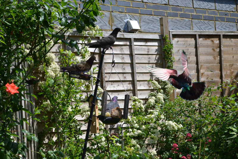
I think this is one of my favourite photo shoots I've done throughout the whole course, I wasn't so sure that something as simple as pigeons in a garden would come out as well as it did. I really like the colours of the flowers juxtaposed with the pigeons in the composition, I think I got really lucky capturing these pigeons flying and with their wings spread especially because none of these photos were blurry. I used my understanding of my camera's shutter speed and aperture to cleanly photograph these fast moving animals. Natural photography is something I've never really had any experience with before so it was very interesting to try it. I had to stay very still whilst taking my photos in order not to scare the pigeons and I also made sure that I took lots of photos so I wouldn't miss out on capturing any good moments.
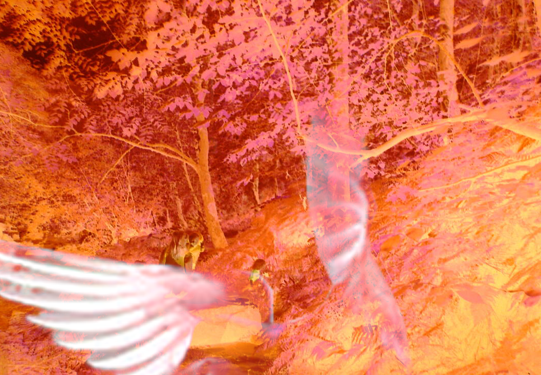
This was my first attempt at combining my own photography with my found photography, I layered the wings of the pigeon on top of a negative. I think this worked really well, with the centre of the wings highlighting the people in the negative, I also think it adds a lot by filling in a lot of the negative space in the photo as well as creating a sense of movement.


This was photoshoot I took as an exploration of the MV Royal Iris, an abandoned ferryboat, as well as an exploration of the surrounding area, I reused a lot of the techniques and stylings that I used for my industrial photography for this photoshoot. I've been interested in different abandoned places and things for a while so it feels good to be able to finally capture this in my photography. This photoshoot did come with some risks though because of the state that the boat was in.


By editing some of my photos that I took from this topic, I created some more industrial style photos using the 'Threshold' effect in photoshop. I think that the Threshold effect is great for creating collages and big compositions of many photos. I used my experience with photobooks to create some of the combined images.
Two Frame Films
|
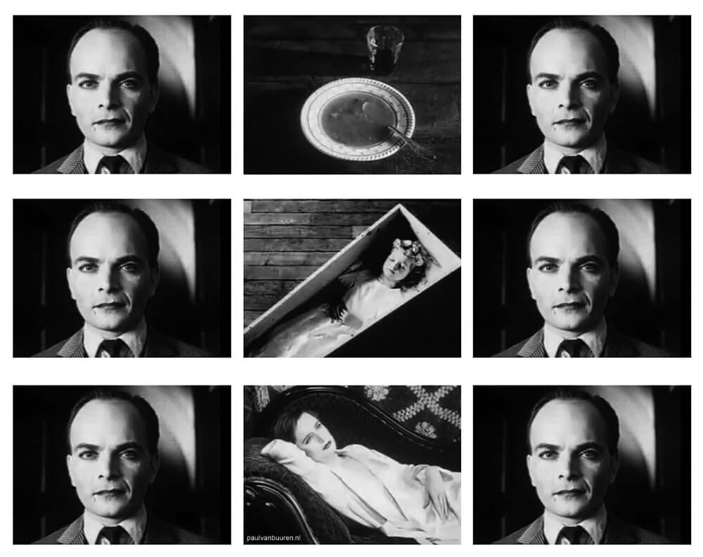
In the imge to the right you can see a demonstration of the effect as displayed by the inventor of the concept, Lev Kuleshov. Although the man in the shots either side of the soup, coffin or woman shows no emotion, the brain can make a connection to assume that the man would be either be feeling 1. Hunger 2. Grief or 3. Lust, respectively, despite the fact that these photos were taken in complete isolation from one another and that the man in the shots had no knowledge of what his shout would eventually be shown adjacent to. I think that as I start to explore diptychs and tryptichs further I will keep this concept in mind so I can not only implement similar or contrasting visual elements but also similar and contrasting conceptual elements, I think that this idea also kind of plays into the audience participation idea that I talked about on previous pages, I could maybe explore ideas about how a viewers assumptions about a diptych or triptych would vary depending on the subject matter and also their individual biases. I would also like to incorporate some elements of video and filmmaking into my later work so I could have this effect in mind when editing whatever I end up doing.
|
This video was created by the class whilst I was absent. In the video the students choose two photos to be put together completely at random. I thinkthat this exercise is pretty interesting as it shows how people can draw meanings simply from their placement next to each other, regardless of whether the meanings were intended by the photographer or not. This reminds me of the idea of "The Kuleshov effect that I learnt about in my film class. The idea behind the theory is that viewers will automatically come to some conclusion of how two shots interact with each other simply based on the fact that they are next to one another, the human brain is attracted to similarity and pattern and so will typically draw a meaning or connection between the two shots whether any connection is made clear by the shots themselves.
|


By the time i got to the cameras there were none left so I had to use my phone and throughout me walking through the school I couldn't find anything that I thought was interesting to take a photo of. I don't really like taking photos whilst in school at all, specifically after the video that we watched of the artist who took such personal and intimate photos, it sucks to take such lifeless and meaningless photos. I would like to improve on my photography in this subject and I think the artwork of the artist that we looked like in the class were very interesting. Hopefully I can find some way to take photos that means something to me in the photobooks area, something I tried and failed to do in the last thing I worked on, postcards for home. I can't entirely blame these photos' shitty outcome on the circumstances and location of shooting them as I don't like the way I framed them either, and I also think that some good photographers would be still able to take great photos despite what had to work with. Obviously there isn't a lot I could've done when it comes to different camera techniques and the more technical aspect of photography but that is something I want to improve whilst I'm working on the photobooks area.
Laura El-Tantawy - In the Shadow of the Pyramids
What was the project about?
El-Tantawy says "In the Shadow of the Pyramids is a first-person account exploring memory and identity. With images spanning 2005 to 2014, what began as a look in the mirror to understand the essence of Egyptian identity expanded into an exploration of the trials and tribulations of a troubled nation", to put it in my own words, I'd say that the project is an insight into her home country of Egypt, and her exploration of using her countries troubles, as a way of understanding and expressing her own personal troubles.
How did it start?
The project started in mid-2005 when the photographer had to travel back to Egypt, her home country after the death of her grandmother. She says "I turned to the streets of Cairo to escape the darkness of death" and also "I found reflections of myself in the chaos around me", I find it very interesting how she initially started her exploration of the country as an escape from her grievance but it later became a possibility for her to reflect and understand that same grievance.
What was the initial aim or start of her journey?
The initial aim of her journey was as a way to escape the "darkness of death" caused by her grandma passing away.
What was interesting about the project?
I find a lot of things about the project and the backstory of the project interesting but something that interests me specifically is her use of blur and movement throughout the project, I think the blurriness really amplifies the chaotic nature of different aspects of Egypt that she tries to capture. I would like to implement something aesthetically similar in my own work but I feel like it would be most effective if it actually meant something.
What does the photographer want to share?
I think that the photographer might want to share an insight into different aspects of Egypt, something that clearly means a lot to her personally and also something that might not have a lot of representation in the other countries that she has lived in; the UK and the US.
Do you think the photographer was in danger during the shoot? Why?
Obviously I don't know the circumstances in which any of these photos were taken, but I do think that a lot of the photos seem chaotic and I think that El-Tantawy might have put herself in situations that she may have usually not have in order to capture her country in the way she wanted to or maybe to get a more honest depiction of Egypt, unchanged by a factor of fear that could have restricted her before.
What drew you in?
I think what initially interested me about this project was the striking colours and the blurriness and movement seen in some of the photos. For a lot of these photos before you can even process what is in the composition, the strong warm colours and lighting is something that immediately jumps out at you.
How were the images used to share her story?
The photos aren't only a look at Egypt but can also be kind of an introspective look at the photographer, possibly drawing ideas from her memories of her childhood in Egypt or also her journey from the US to her home country and the difference in lifestyles.
What kind of camera do you think she used?
I can't really tell what kind of camera she used from the photos I've seen, some of them seem more like they were taken on a film camera and some of them seem more like they were taken on a digital camera, something that makes me think she used a digital camera was the purposeful use of blur, this may have been easier to achieve using the more precise shutter speed, but i still may be wrong as I am not that familiar with different technical aspects of photography.
Thought on the books and their presentation?
I really like the presentation of the book, I think that I will definitely try to incorporate subtle text or found photography, specifically of old home photos, as I try and create my own photobook.
How would these images be shared in an exhibition?
Obviously that is entirely up to the photographer to decide, but I definitely think that a lot of these images should be printed large, I think that a lot of the photos are so intricate and complicated and that they would be best viewed in a way where these intricacies can be seen more close up.
In what other ways can you image these photos being shown?
I think that this project could look good in video form, going from the first photo that El-Tantawy took in Egypt to the last, going chronologically. I think that this could be good because it would be interesting to see the photographers different approaches and ideas changed over the course of the project.


These are some of the photos I took in class after looking at industrial themed photography as a class. I initially decided that instead of taking photos I wanted to make some photograms in the dark room since I could explore some black and white, which was shown in a lot of the photography that we looked like as well as it being easy to implement different textures and the way light passes through them. I used sellotape and casette tapes that i found in the dark room and captured them, I also took some photos around the dark with my phone when I was in there since I think that it looks quite industrial with all the equipment and I also love how it looks in there with the red light on. I didn't anything I had made either from my phone or the photograms were particularly interesting so I used photoshop to combine some of the photos using different layer effects and experimented with colour and the light threshold to get what I wanted. Overall I think I'm pretty happy with what I made, I came in pretty late to class so I didn't have a lot of time to complete my images but I think the messy effectmost likely created by my rushed working adds to the messy industrial aesthetic that I had been going for anyway. I would love to explore this look later on in my photography work and I had thought about making things similar to this even before this task, The images that I ended up with and the ones we viewed as a class kind of remind me of one of my favourite movies "Tetsuo: The Iron Man" and I have always wanted to create a similar artwork either in Film or Photography.


City Photos.
I think these photos are ok but I think they all look kind of similar, I think part of the reason why I don't love these photos is because I took most of them so near to my house. I think that I'd be a lot happier with photos that I took if I had taken them in places I'd never been before.
I think these photos are ok but I think they all look kind of similar, I think part of the reason why I don't love these photos is because I took most of them so near to my house. I think that I'd be a lot happier with photos that I took if I had taken them in places I'd never been before.


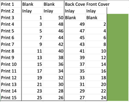
This is my page plan for my next zine, the photos 5,7 and 9 are intended to be inlays that are put over the pages in 4, 6 and 8 respectively. I want to do it with tracing paper or some other translucent material. I am struggling to get the printing right for this one in similar ways to how I struggled with the last zine, where I keep putting them on the wrong side.
I like how this new zine ended up, obviously I prefer the images of this one since I was using my own but I don't think it was as neat as the first one, the press left marks on the paper and the tracing paper pages were quite misaligned. I don't think I would like this to be my final zine since there's clearly a lot I can improve on in both the shooting process and the zine production. I would like to add something to the cover too since It's just been left blank like the last one and i think it's kind of uninteresting. I also think that maybe a lot of the stuff this photo-book can be seen as over-edited and hard to draw connections from, I'd like to try and spend more time working on portraiture and more conventional forms of photography as I think it could be an easier way to explore different themes and a way to contrast them. I think the biggest thing I need to keep in mind for my next zine or book is that I need to take a lot more photos, although I do like the photos in this zine, there is not a large quantity of them, if I create a lot more images it will be easier explore different of ideas of contrasting themes and aesthetics just by having enough photos to choose and select what works best. When it comes to the production of the zines/books I would also love to experiment with different ideas such as sewing them or binding them differently, one thing that I think could be good as a way to neaten my execution of the work is by pinning down the pages as a way to check if they're in the right place before doing the final stapling or sewing. I am also intrigued by by creating brighter and happier looking images, most of my photos are taken in the dark and/or have harsh colours, I do like this style a lot but I don't want to be stuck with only one aesthetic for my photography and I want to be able to show some variety in my ability. I don't want my work to exclusively be a reflection of my discontent and negative feelings I feel and I think it would be great but challenging to try and represent a more optimistic outlook on the world. Obviously someone's mind has a major impact on the work they create but also I believe that someone's work can have a major impact on the creator's mind. As such I think that not only a happier aesthetic might show greater variety and ability in my work but I believe it could be good as a way to improve my mood and outlook of the world.
Photobook analysis: TWENTYSIX PIZZA BOXES
I was given this photobook to analyse, at first I thought it could br wuite difficult to analyse as it is a fairly small photobook with not a lot of difference in the selection. Of course the first thing to consider is the cover, at first I thought nothing of it as it is minimal red text on a white background but I later realised that the font used here is the same as a lot of what can be seen on a pizza box, and the colour scheme that it took, red and white, can also be commonly seen on a lot of pizza boxes.
The first image in the book is one of a pizza box displayed in an art exhibit. The box is crumpled and dirty but despite this is being shown in what can only be interpreted as a prestigious gallery, the pizza box is standing on one of it's corners in such a way where it looks as if it's being precariously balanced. There are other objects in the frame that are also seen to be displayed here including some arrangement of sand bags and a wooden slab that is being presented in a similar way to the pizza box. This image directly contrasts the rest of the images in the book due to it's unconventional placement of a pizza boxes. A more typical location of a pizza box is shown across from the first image on the next page, it appears to be placed next to a trash can in the middle of a street. One comparison that I have speculated on between these first two images is the contrast in the quality of the box. In the first image, the box is crumpled and dirty, looking worn and disregarded despite the gallery that it's in. In the second photo, as I said, the photo is in a lot more of a derelict location, however, the quality of the box is good. It appears that the pizza box is fairly clean and neatly folded. This analysis may be somewhat pretentious but I imagine this comparison highlights the thought process of the artist behind the exhibition of the first image. We can see the box is ragged and practically falling apart, but by looking at the photo directly next to it and more or less every other pizza box in the book, even if the packaging has been well used and disregarded into waste, they are typically not as destroyed as the example of the initial image. This makes me wonder how much the artist changed the pizza box after they had found it, or maybe they even created the box themselves? By the look of what small portions of this exhibition that can be seen in the photo, this thought process matches up, for example the wooden slab in the background is broken and more or less warped out of shape, it makes me wonder what kind of manipulation this object had to undergo, especially as it is designed to withstand a lot of pressure and is typically used for stacking on an industrial scale. I think obviously it's interesting to consider the contrast between the items and the location but somewhat even more interesting to speculate on the artist's intentions of creating this at all. I imagine this artist would have intentionally shaped this contradicting imagery and I would love to delve into the idea of how much involvement there was in the process of the destruction of the objects. I can only envision in my head some inspired artist twisting and stamping on these objects so they can be "just right", I feel like a clean and well kept pizza box and slab could never have the same effect of intrigue that the crumpled one does. One thing that gives me greater confidence in my theory is the shadow of the box. Multiple lights from above shine down onto this package from different directions highlighting it's interesting curved shape that has taken the place of the typical rectangular shape of a pizza box. The third and fourth pages have 4 different images, changing the layout from an image taking up a whole page as seen on the first two pages, they are now smaller images shown with two on each page, every image on these two pages show pizzas boxes in clear plastic trash bags, I can't think of any deeper themes being portrayed in these images but I think that the subject matter is very intriguing, I like the idea of taking photos of a very specific thing, I feel like doing this would give the process of going out and taking photos an easter egg hunt type feel to it. I honestly don't think most of the images in this book are particularly visually striking and I don't think that this type of photography where you have to search for the thing you want to take photos of is something that I would want to pursue, in the photobook area or otherwise. For me at least the thing that is most enjoyable going out and taking photos is the idea that you never know what you are going to see, you could capture something that you would have no idea was something you even want to take a photo of before if you give yourself the freedom of not only taking photos of the same object. There could possibly be more rewarding ways to go about this concept but I don't see exclusively taking photos of pizza boxes really falls under this category. Pizza boxes are a very common thing, which is something may have aided the photographer in taking these photos but, something becomes apparent as you look through this book and that is the complete lack of variety of places that pizza boxes can be found. Excluding the initial photo here are hardly any images in this collection that makes me go "Wow, I would have never have expected a pizza box to be there!" because pizza boxes dont get put in interesting places, they get put in a bin or dropped in a street. I don't want to be completely bitter about this book but there is hardly anything in here that is something that I'd even give a second thought about in here if I saw it in real life.
3rd zine ideas: For my next zine I think what is most important is focusing on using text and also creating a good cover. I like what I have done for the first two zines but I think that a lack of change of the two is kind of frustrating. Neither of them contained any interesting text and I did want to do a cover for the second one but eventually chose not to out of the inconvenience that comes with printing onto card. Another thing that I want to incorporate in my next work, whether it be a zine or not, is using some of the slides that I bought in a junk shop. I bought somebody's home slides from the 70's in this shop and I really like the way they look. A problem that I've run into though is the difficult nature of scanning in slides, I may try and figure out the best way for me to scan them in or I could also just make use of them by using a slide projector.


|
|
This is the first draft of my final book. I like the photos that I used and the variety of them but I think that my ideas can definitely be improved. I'm interested in using to text to create some sort of overarching narrative or theme to the images so they don't seem so disjointed. I also want to print onto black paper so I can avoid getting white lines on the edges, I definitely will use a different kind of paper or printing technique next time so that the print doesn't come out so shiny.
|
I'm a lot happier with the presentation of this photobook than my previous attempts although it's still messy. I like the photos I used a lot more too. I feel like the best thing about my selection of photos here is the fact that they are all very varied in their subjects and their aesthetics but they all still work very well together. I think something I would add if I were to make another photobook would be a cover with some more photography on it.
